
This project explores a contemporary rebranding of iconic albums by Israeli musician Rami Fortis, focusing on Shoter Poshéa and HaAnak HaLochesh. The work reinterprets the albums through a new visual language, creating a cohesive branding system across physical formats such as vinyl records, cassette covers, and packaging. The goal was to honor the raw spirit and cultural significance of the original music while translating it into a bold, relevant visual identity for a new generation.
The Concept
The concept behind the project was to reinterpret Rami Fortis’s albums through a contemporary visual lens while preserving their raw, rebellious essence. The visual language draws from themes of tension, conflict, and inner voice that run through the music, translating them into graphic symbols, bold compositions, and expressive typography. Rather than recreating the original covers, the project builds a new branded world that connects past and present, turning the albums into a unified yet distinct visual system.
The Visual Language
The visual language of the project is bold, raw, and expressive, reflecting the uncompromising spirit of Rami Fortis’s music. Strong typography, high -contrast color choices, and graphic symbols are used to convey tension, rebellion, and emotional intensity. The system balances structure and chaos, allowing each album to maintain its own character while remaining part of a cohesive visual identity. This approach creates a contemporary graphic language that feels direct, powerful, and culturally rooted.
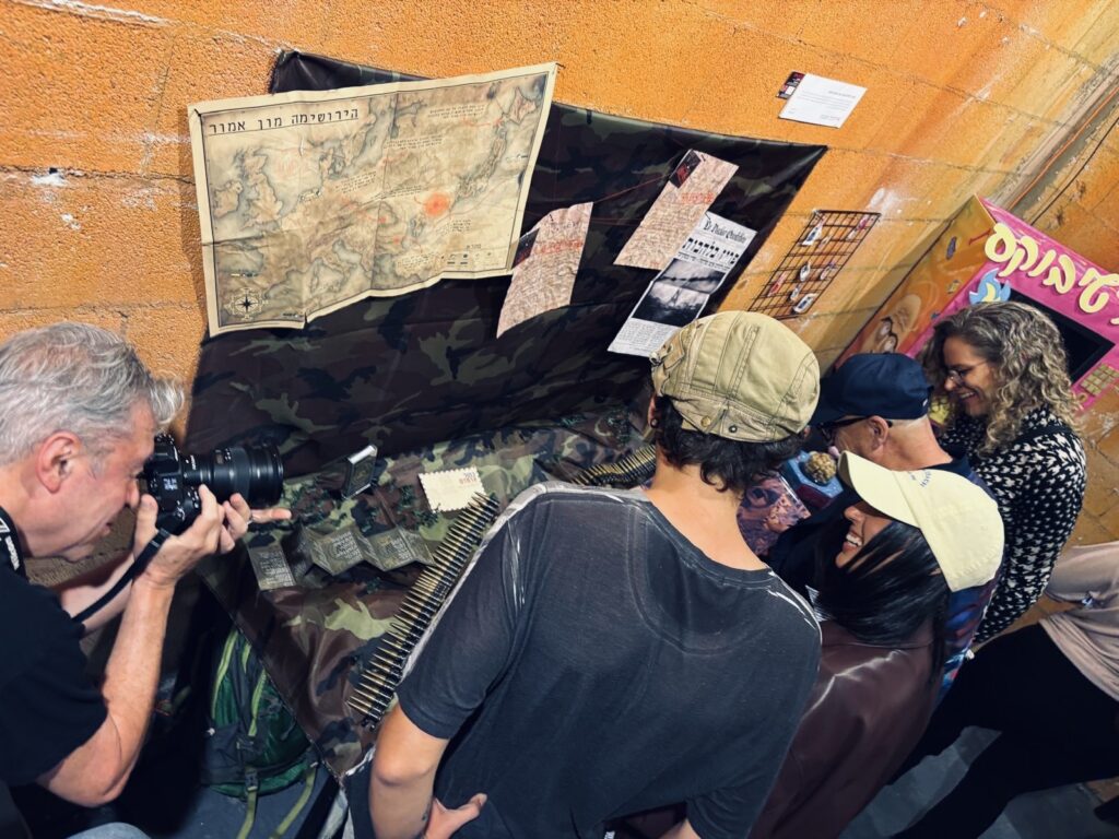
Vinly Record – Military Concept
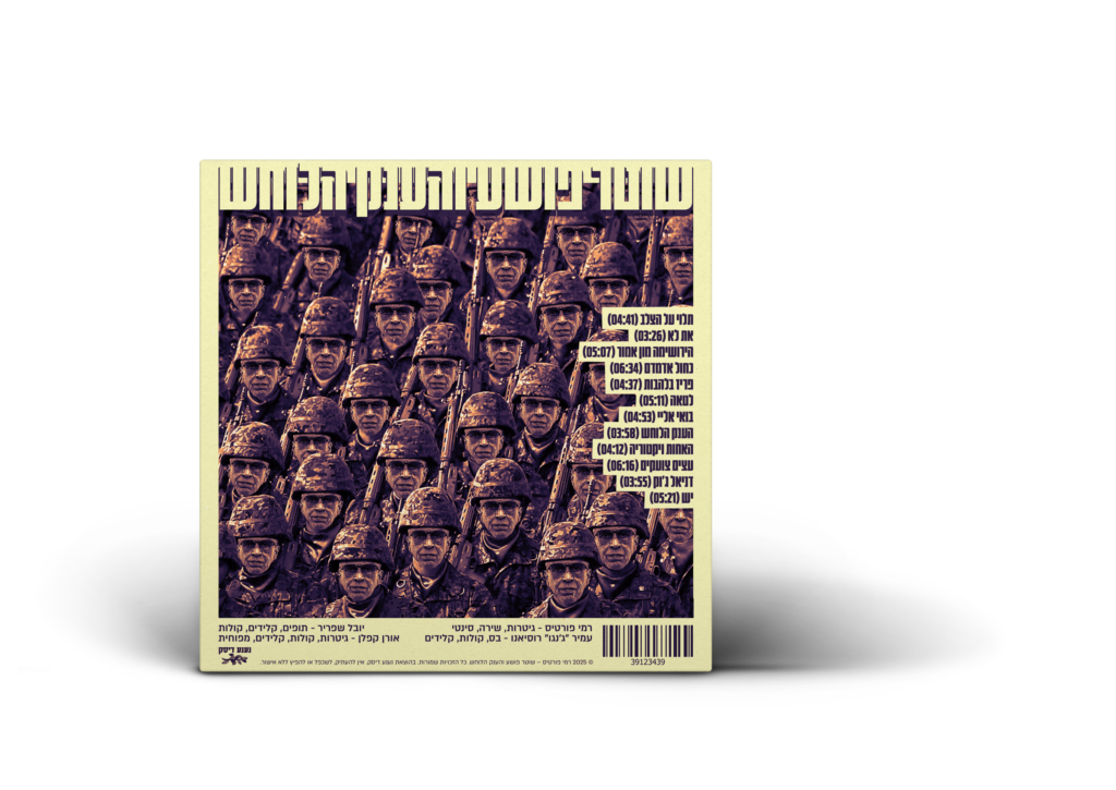
The vinyl record is built around a military-inspired visual concept, drawing from ideas of authority, hierarchy, and discipline as metaphors found within Fortis’s lyrical themes. The graphic language references uniforms, symbols, and structured compositions, creating a sense of order that contrasts with the raw, rebellious nature of the music itself. This tension strengthens the album’s narrative, turning the record into a visual statement that reflects conflict, power, and inner resistance.
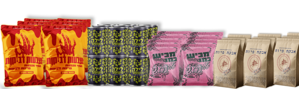
Packeging – Supermarket Concept

The packaging reinterprets the albums as everyday supermarket products, inspired by the visual language of Rami Levy Shikma Marketing. By placing Fortis’s music within a familiar commercial environment, the project creates an ironic cultural commentary on mass consumption and accessibility. The contrast between rebellious musical content and utilitarian packaging transforms the albums into approachable, almost mundane objects – challenging traditional perceptions of music packaging while emphasizing the intersection between culture, commerce, and identity.
Leave a Reply