Author: admin

  • Reset

    RESET is a UX/UI concept for a wellness app connected to a smartwatch, designed to encourage mindful pauses and daily balance through calm design, gentle notifications, and simple interactions that fit naturally into everyday life.


    The Product

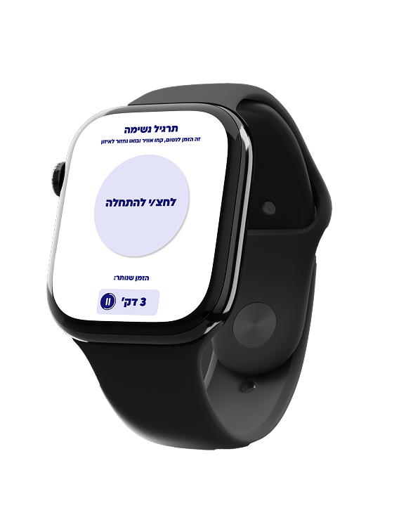
    RESET is a smartwatch-connected wellness product that supports mental balance through short, intentional moments of pause. The system combines a mobile app and wearable interaction to gently guide users through breathing, awareness, and reset actions during the day. By focusing on simplicity and emotional comfort rather than performance tracking, RESET turns wellbeing into a calm, accessible, and repeatable daily experience.


    The flow

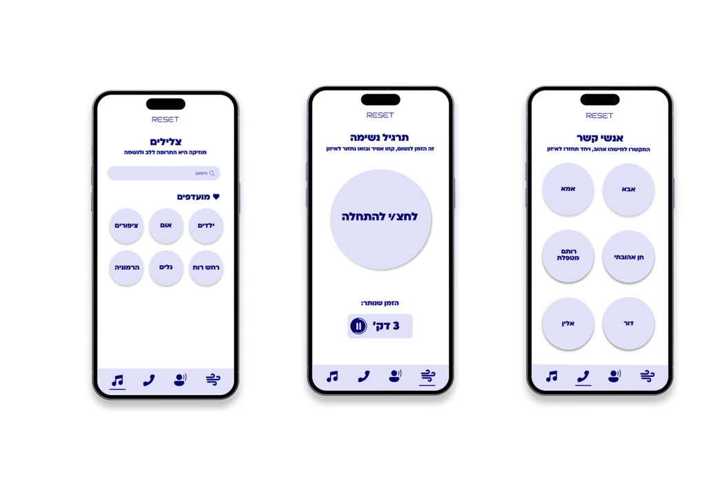
    RESET was designed with a calm, frictionless user flow that supports short moments of pause throughout the day. The experience begins with a simple onboarding that sets personal intentions, followed by gentle smartwatch prompts that invite the user to reset. Each interaction leads to a brief guided action—such as breathing or awareness—before smoothly returning the user to their routine, keeping the flow light, intuitive, and non-disruptive.


    RESET is supported by a freemium business model, offering essential wellness features for free while advanced personalization and guided content are available through a subscription. From a SWOT perspective, the product’s strengths lie in its calm, minimal user experience and smartwatch integration, while challenges include user consistency and market saturation. Opportunities stem from the growing demand for mental wellbeing solutions and potential partnerships, alongside threats from strong competition in the wellness app space.

  • Adidas Restart Campaign

    The task was to create a conceptual marketing and branding campaign for Adidas, focused on strengthening the brand’s connection to everyday urban life. The goal was to translate Adidas’ values of movement, motivation, and community into a relevant, real-world experience that goes beyond traditional advertising and encourages active engagement within the city.


    The Challenge

    What problem needed to be solved?

    Urban life often disconnects people from physical activity, while sports brands mostly communicate through performance and elite athletes. The challenge was to create a campaign that feels accessible, motivating, and relevant to everyday city life — not just to professional runners.


    The Idea

    What is the core concept?

    Restart Points+ reimagines the city as a network of physical and digital restart moments. Inspired by gaming mechanics, the concept turns urban spaces into motivational checkpoints that encourage people to pause, reset, and keep moving — at their own pace.


    The Outcome

    Why does it work?

    The concept positions Adidas as a brand that supports everyday movement, not just athletic performance. By blending motivation, gamification, and urban culture, the campaign builds a stronger emotional connection and encourages long-term engagement.

  • Urban Trade App

    Urban Trade is a UX/UI project for a second-hand marketplace app that connects people through smart, city-based trading. The project focuses on intuitive navigation, trust between users, and a clear buying–selling flow, combining user research with a practical, real-world digital experience.

    Why Urban Trade?

    Second-hand trading has become part of everyday urban life, yet existing platforms are often cluttered, untrustworthy, and time-consuming. Users struggle with unclear listings, poor communication, and unsafe or inconvenient hand-off processes.

    Urban Trade was designed to solve these challenges by creating a city-focused marketplace that prioritizes clarity, trust, and ease of use. The app simplifies the buying–selling journey through intuitive navigation, verified user interactions, and location-based exchanges, turning second-hand trading into a smooth, reliable urban experience.


    The Flow

    Entering the app


    Product order process


    The app screens


    Urban Trade was designed with a clear and intuitive user flow that guides users from onboarding into browsing, buying, or selling with minimal friction. The experience emphasizes easy navigation, transparent product and seller information, and a simple transaction process that builds trust and confidence throughout the journey.

    Urban Trade’s features are designed to reduce friction and build trust in second-hand trading. Location-based browsing, clear product information, and simple communication flows make buying and selling faster, safer, and more intuitive—turning everyday urban trading into a smooth and reliable experience.

  • Fortis Collab

    This project explores a contemporary rebranding of iconic albums by Israeli musician Rami Fortis, focusing on Shoter Poshéa and HaAnak HaLochesh. The work reinterprets the albums through a new visual language, creating a cohesive branding system across physical formats such as vinyl records, cassette covers, and packaging. The goal was to honor the raw spirit and cultural significance of the original music while translating it into a bold, relevant visual identity for a new generation.

    The Concept

    The concept behind the project was to reinterpret Rami Fortis’s albums through a contemporary visual lens while preserving their raw, rebellious essence. The visual language draws from themes of tension, conflict, and inner voice that run through the music, translating them into graphic symbols, bold compositions, and expressive typography. Rather than recreating the original covers, the project builds a new branded world that connects past and present, turning the albums into a unified yet distinct visual system.

    The Visual Language

    The visual language of the project is bold, raw, and expressive, reflecting the uncompromising spirit of Rami Fortis’s music. Strong typography, high -contrast color choices, and graphic symbols are used to convey tension, rebellion, and emotional intensity. The system balances structure and chaos, allowing each album to maintain its own character while remaining part of a cohesive visual identity. This approach creates a contemporary graphic language that feels direct, powerful, and culturally rooted.


    Vinly Record – Military Concept

    The vinyl record is built around a military-inspired visual concept, drawing from ideas of authority, hierarchy, and discipline as metaphors found within Fortis’s lyrical themes. The graphic language references uniforms, symbols, and structured compositions, creating a sense of order that contrasts with the raw, rebellious nature of the music itself. This tension strengthens the album’s narrative, turning the record into a visual statement that reflects conflict, power, and inner resistance.

    Packeging – Supermarket Concept

    The packaging reinterprets the albums as everyday supermarket products, inspired by the visual language of Rami Levy Shikma Marketing.
By placing Fortis’s music within a familiar commercial environment, the project creates an ironic cultural commentary on mass consumption and accessibility. The contrast between rebellious musical content and utilitarian packaging transforms the albums into approachable, almost mundane objects – challenging traditional perceptions of music packaging while emphasizing the intersection between culture, commerce, and identity.

  • Miza Web

    MIZA is a digital platform focused on food, hosting, and curated experiences.
 The project explores how a brand rooted in sensory and physical moments can translate into a digital environment. The website was designed to function not only as an informational platform, but as an experiential space — one that reflects atmosphere, materials, and emotion through layout, imagery, and interaction.

    The Definition

    MIZA is defined by a focus on food as a sensory and social experience.
 The brand centers around moments of hosting, materiality, and atmosphere, emphasizing quality, simplicity, and attention to detail. Rather than presenting food as a product, MIZA frames it as an experience – one that is calm, refined, and emotionally driven, translating physical hospitality into a thoughtful digital presence.

    The Goals

    The goal of the MIZA website was to translate a physical, sensory world into a digital experience without losing its warmth and intimacy. One of the main challenges was avoiding a catalog -
like structure, instead creating a calm and immersive flow that emphasizes atmosphere and storytelling. The design balances clarity and usability with emotion, ensuring the site feels refined yet approachable while guiding users naturally through the content.

    The UX Strategy

    The UX strategy for MIZA focuses on clarity, flow, and emotional pacing. The site is structured to guide users intuitively through content, using a minimal navigation system and a clear hierarchy that reduces cognitive load. Instead of overwhelming the user with information, the experience is built around rhythm, white space, and deliberate pauses, allowing content and imagery to lead the journey. The strategy prioritizes exploration and feeling over speed, while still maintaining usability and accessibility.

    The Responsive Thinking

    The website was designed with a responsive -first mindset, ensuring the experience remains consistent across different screen sizes. The layout, typography, and visual hierarchy adapt fluidly to mobile and tablet views without losing the brand’s calm and refined atmosphere. Responsive decisions were made to preserve clarity, pacing, and usability, allowing users to engage with the content naturally regardless of device.

  • Apero

    APÉRO is a full branding project for a cheese and charcuterie deli, built around the idea of pairing
and mingle as the core brand value. The project includes the development of a distinct visual language, logo system, posters, business cards,
and packaging, all based on the contrast and connection between opposites – cheese and meat, soft and bold, classic and playful. Through branding tools and graphic design systems, the work creates a clear, cohesive, and recognizable brand identity.


    The Logo

    Typography
Bold, hand-drawn typography with imperfect lines creates a warm, relaxed, and effortless feel premium, yet approachable.


    Colors
A Mediterranean, food inspired palette of red, green, mustard, and cream that conveys appetite, authenticity, and soft luxury with a subtle vintage touch.


    Symbol
The crown sits at the heart of the symbol, representing quality, careful curation, and a high standard, while its soft, imperfect form balances the luxury with an accessible, contemporary feel.


    The Posters

    The posters were designed in a natural, candid photographic style to convey real social moments and mingling at the core of APERO’s DNA. The warm, vintage-inspired aesthetic creates a Tel-Aviv atmosphere that feels intimate, stylish, and effortlessly premium.


    The Icons

    The icon style is based on loose, hand-drawn lines and imperfect shapes, creating a warm, human, and effortless feel. This illustrative approach reflects the brand’s everyday character and its focus on simple pleasures, quality food, and natural moments of gathering. The icons support a cohesive visual language that feels approachable rather than formal, reinforcing APERO’s identity of precise simplicity and understated style.


    The Differentition

    The social media mockups expand APERO’s brand world into the digital space, showing how the identity translates across everyday online touchpoints. The content emphasizes atmosphere, texture, and human moments around food, rather than promotional messaging. Through a restrained visual language and a calm, confident tone, the brand maintains consistency while feeling natural and approachable. Social media becomes a place for inspiration and connection – a continuation of the APERO experience beyond the physical store.